

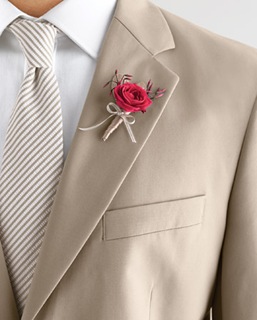
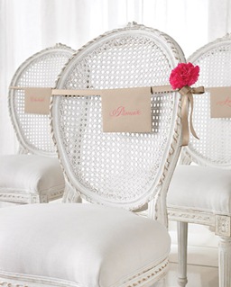
The new Martha Stewart Weddings is out and has a beautiful feature on the colour combination of fuchsia and taupe.
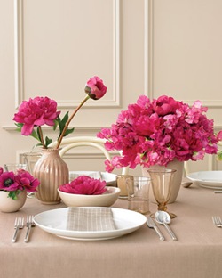
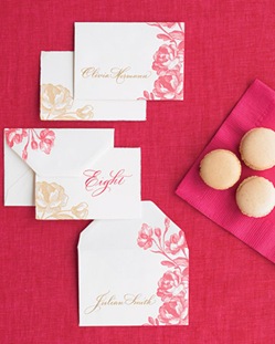
The taupe really makes the fuchsia pop, but it’s a little softer on the eye than fuchsia paired with white. The warm undertones give a cosy feel, but can be made cooler if paired with the right colour.
Taupe is such a lovely neutral colour that it can really work with any colour scheme:
Bolds and Brights
- Tangerine green
- Lime green
- Cherry red
- Aqua
- Purple
Modern Moody
- Gunmetal gray
- Black
- Chocolate Brown
- Silver
- Teal
Soft and sweet
- White
- Pale green
- Pale yellow
- Pale Pink
- Pale Blue
Images courtesy of Martha Stewart


Really!!! Thanks Ms Polka. Would not want to miss out on this one.
Love that color! 🙂
I love the color combination. It’s refreshing, yet oh so chic!
Beautiful Colors! I would love to see the taupe and tangerine too. Love & Soul Always, Kay
i LOVE this palette. leave it to martha to make me want to changes every plan i have with three months to go. sigh.