Bold colours are making their way into our wedding mood boards again this year. Colour can evoke emotion and moods that set a tone and vibe for your wedding day. But translating those colours into elegant stylish stationery can be a tricky task.
Whether you select bold or soft colour tones for your big day, the most important element in keeping the look elegant is to achieve a good balance. Following some tried and true design rules can help achieve the look you are after. These ideas are simple and easy for any DIY couples to apply to their stationery and styling elements.
Tip 1: Limit the number of colours
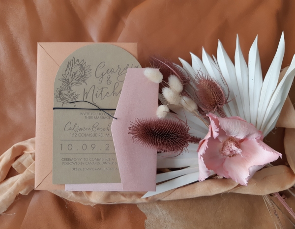
It can be difficult to narrow down the choice of colour. However, by limiting the number of colours in a design, it can create a more complete and consistent feel. Using too many colours can (but not always) make a design look incomplete and busy. Try taking one or two out and seeing what you think. Add them back in if you need but sometimes less is definitely more. Also try choosing different tones of the same colour(s) next to each other on the colour wheel to create a little more harmony.
Tip 2: The 60 / 30 / 10 Rule
Balancing the right amount of each colour in the design can be made easier by applying a simple design rule of 60/30/10. The main colour of our design will be represented in 60% of the design, followed by another colour at 30% and a final colour of 10%. This rule is used by interior and graphic designers and can be really useful to create a balance for the eye. Don’t be afraid to substitute one of these colours with a texture, or pattern. Small accents of gold and silver can be added if you are looking for a feel of luxury.
Tip 3: Embrace Texture
Texture is often overlooked when working with paper and stationery. While texture can be represented visually with the use of imagery, the use of items and materials that add a physical texture to your stationery can lift a design and create a tactile experience.
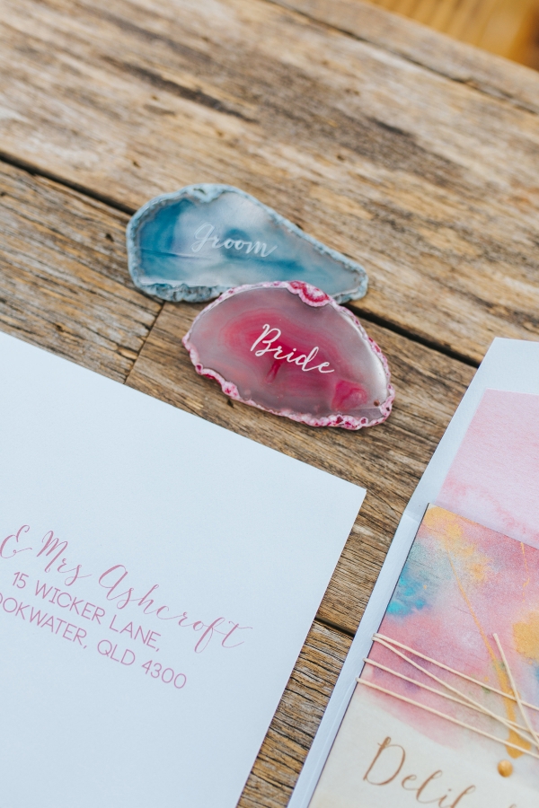
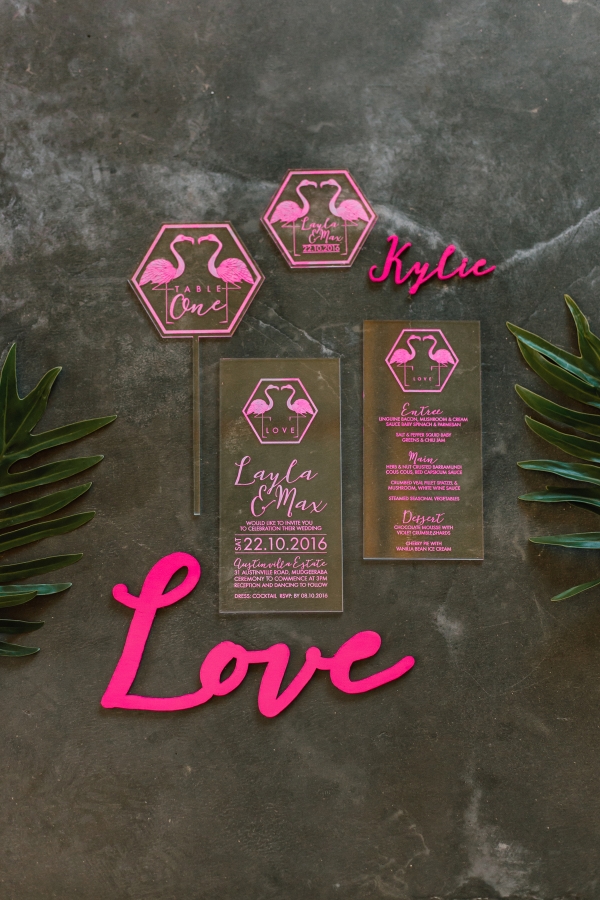
Luxurious textured papers, woods and acrylics worked in with your main colours can help enhance the elegance and style in your suite. Try using textured papers or some leather, wood or acrylic as your base material. Or an alternative printing method such as Letter Press, foiling or engraving.
Tip 4: Adding colour through other elements than just ink
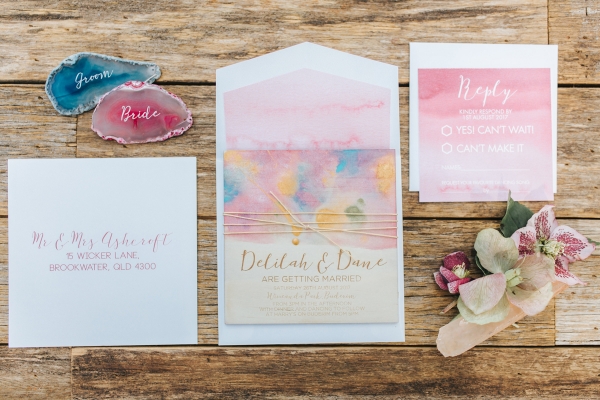
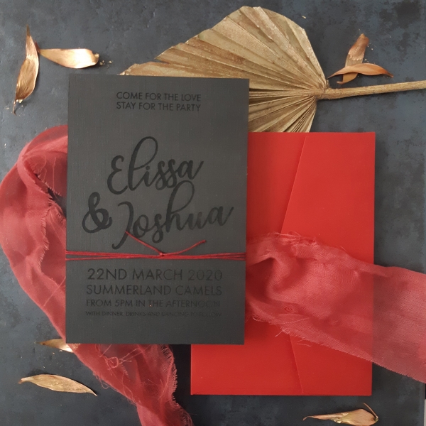
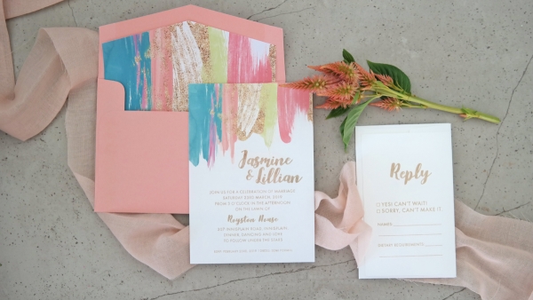
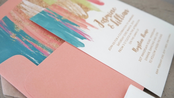
Incorporating colour through the other elements of your stationery suite rather than just the printed image or text is a great way to bring in colour. For example, the envelope and envelope liner, ribbons or twines. This suggestion is ideal for the couple wanting a more sleek, simple invitation but with a solid punch of colour.
If your design allows, ribbons and twines in luxe colours can add a sense of elegance to your suite and add in that additional touch of colour.
Colour is fun! And on a day that is filled with love and fun we say use it! Follow some of these simple tips and your colour filled wedding day will be a hit!
Ms Zebra Says: These are wonderful tips to include colour into your wedding stationary! Colour can be so meaningful and such an easy way to set the tone for your entire day.
About The Rustic at Heart: it is our passion to tell love stories through event stationery and signage that is created out of materials with texture and elegance. We offer wood, leather, acrylic and linen paper all laser engraved with modern designs to create unique stationery packages. Any theme, colour or style. We love to create packages to suit all our couples stories.




Join the conversation