

2020 – The start of a new decade and full speed ahead for super bold, boundary pushing colour at weddings for us designers, florists and stylists!
Colour blocking is really big right now and is primarily being used in two different ways. Here’s the breakdown.


Method #1
Select one principle colour and then use multiple tones within that colour to support the scheme.
Let’s say for example, dark pink, mid pink and light pink, it’s a safer way to colour block and can bring harmony to any design, while still being bold with a colour choice. For this approach to work apply the colour tone to everything from flowers to vases, candles to graphics, feature backdrops and bridesmaids dresses. Often this approach is supported with a neutral base colour such as white, greys, blacks.


Method #2
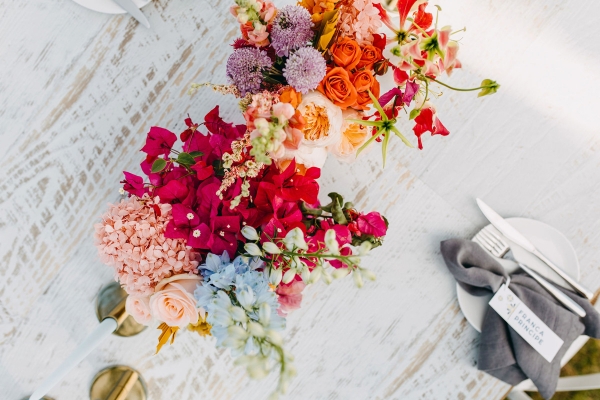
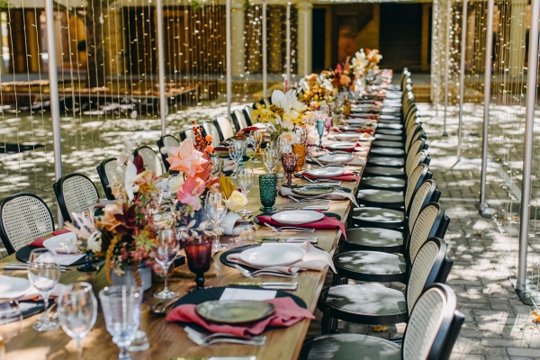
Choose three or four different colours that sit harmoniously with each other but are applied in their own confident fashion.
Think one tablescape that is all mustard, one that is all burgundy and one that is a forest green. Colour is applied to specific elements on the table such as the napkins, the vase and the flowers. We often then combine the three or four colours to create feature pieces such as welcome boards or seating charts that emphasises the colour scheme and pack a visual punch of the collective colours.
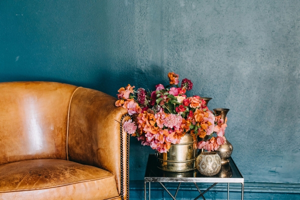
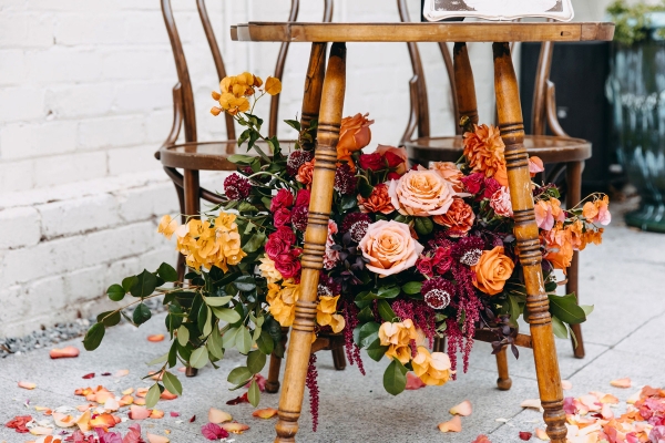
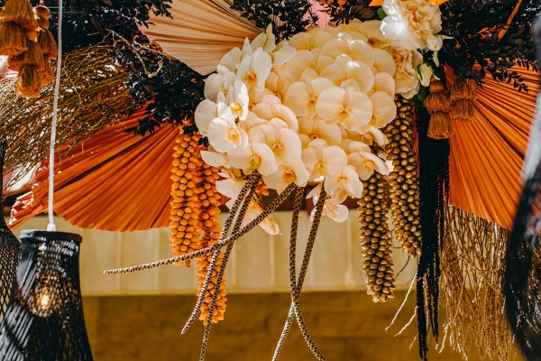
We are also seeing colour schemes that are coming from a more traditional colour blocking approach. As an example, blues teamed with rusts and supported with tones of oranges and peach.

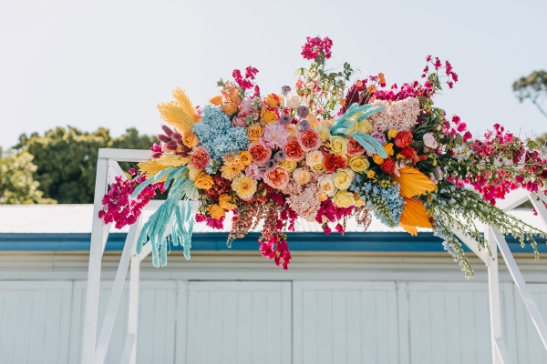
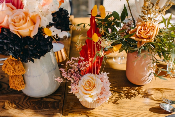
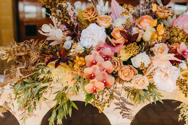
For those that think colour blocking is still too restrained, we are here to say big, bright and bold colours all mixed together is taking the average wedding to a whole new level! With the new preserved floral range hitting the Australian market you can basically have any colour from the colour wheel – bright blues, fiery reds, ultra violet purples and so many more!
We are seeing stylists and florists blend these bold colours seamlessly creating a joyful burst of colour, especially in all things florals, graphics and soft furnishings. We are also seeing lots of colour coming into the furniture hire sector. We can now have oxblood or coral lounges and add mustard cushions for a punch of colour.
The trick to mixing lots of different colours, is to ensure the colours are all as strong as each other, so choose colours that have the same depth. To get some variation choose tones of each colour to start blending the colours together.
Often more than not following the rules of the colour wheel helps – colours opposite each other are complimentary (like blues and oranges) or colours that sit next to each other on the colour wheel are often pleasing to the eye as they are harmonious (like reds and pinks).
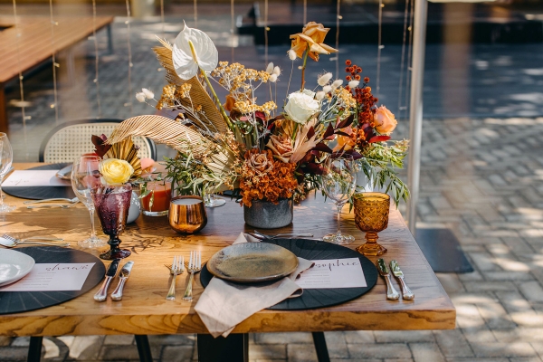
So, when we think about colour and use colour in practice we think of dressing the whole space, head to toe!
![]()
Ms Zebra Says: I love the use of colour for events – it certainly brings a whole new element to the day! These are great tips and examples to not be afraid of a little colour.
DUO events Creative Studio is a full service planning, design, floral and production studio; they create and execute one-off event designs. Their events are more than a gathering they are an exceptional experience. Every detail is bespoke and every element considered suiting your vision.
Duo Events are distinctive, flexible, considerate and meticulous and these principles drive the quality of their work.
![]()


Black being the most elegant and rich colour, it’s amazing to see the black themed wedding, one of my friend got a black-themed wedding invitation, it was hard one offline in our country India, it included a variety of designs to choose. single page, multiple pages type, animated type, gif type, video type etc. It was wonderful that we get to design our own wedding invitation at the most affordable price.